
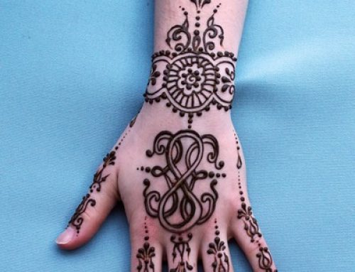
Project Description
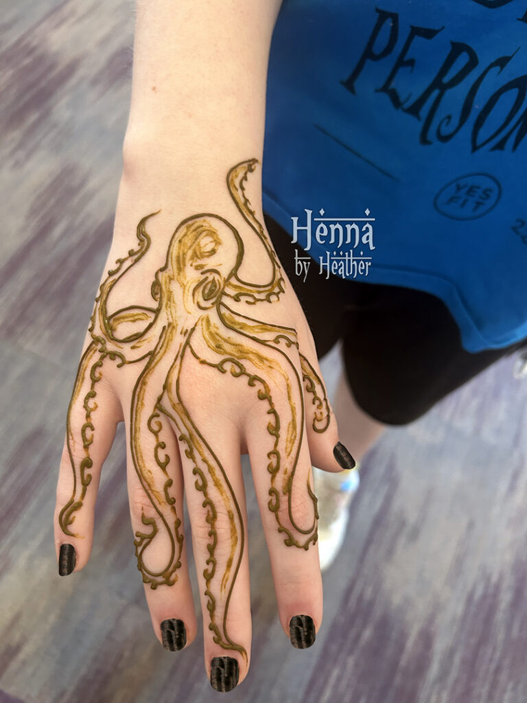
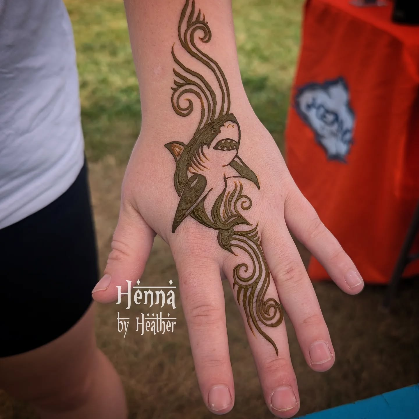
Quick and simple henna octopus design with tentacles on fingers, shown with henna paste still on the skin
In today’s edition of Heather Over-Explains It All, I’d like to share some tips for drawing your own octopus henna design successfully. This advice should also help you with creating your own tentacley creatures in any other medium, where this sort of balance between the realistic and the cartoony is juuuust right.
This betentacled henna octopus design is, I believe, the best one I’ve done to date in my 25+ year henna artist career. And this is coming from someone who is from the state where the Elder Gods were first conceived and the official state appetizer is sliced rings of tentacled creatures, who, to boot, is a founding member of a band named Call of Kazulhu! Believe you me – I have drawn a lot of images of Cthulhu, the Kraken, octopi, and adorable squid in my day.
So that’s why when someone asked for an octopus design at a teen summer reading program at a local Boston area library, and I only had five minutes to make it happen, I was able to rise to the challenge.
And now, in proper mentor-type fashion, so you can learn in just a few hours of practice what took me basically a lifetime to figure out, I now present:
Five tips for Drawing a Simple, Realistic Octopus in Henna
(or the Kraken, or Cthulhu, or any other such creature – in any line-art style medium, including pen & ink drawing, scratchboard, black and white illustration, pencil sketch, etc)
1. Sketch the overall flow of the design first.
Decide where you want the various tentacles to go. Draw simple curved lines to show the general direction. You’ll want there to be some places where the tentacles overlap, but not too much. Too much and it gets cluttered. Not enough and it looks too ordered and not organic. Here we’ve really just got one major area of overlap where one tentacle completely crosses over another.
2. Figure out how they’ll all be connected.
Put some kind of head or body to have all the tentacles coming out from. This will vary depending on the level of realism you are going for, what type of creature you’re drawing, etc. Also, deciding that where they connect is “off screen” is fine – but know where it is, and what direction they’re coming from, so that when you draw them the flow looks right.
3. Draw little C’s for the henna octopus’ suction cups.
After you’ve sketched light lines for both sides of each tentacle, decide which one is the “bottom” of each, and do a row of outward-facing C’s all along it. The C’s start a little bit away from where the tentacles connect to the body/head. Sure, there are other ways to draw suction cups – but this way is fast and looks good every time.
4. Spend some time getting the eyes right.
If your creature has eyes, they’ll be the second thing people notice after the overall flow of the tentacles. So spend some time getting them to look right. Either use a reference image, or make them up off the top of your head if you’re not going for realism, but make sure they’re awesome – whatever awesome means for the style you’re working in.
5. Add some shading. But don’t go super nuts.
Add some shading to the design if you want it to look more realistic. Even if the light is coming from the lower right of the hand (uh, mostly), sticking with a mostly-consistent light source and imagining where shadows would fall based on that will help it read ad more realistic. Definitely leave some highlights un-colored-in for some nice contrast.
And last but not least:
Don’t be afraid to throw in a random other tentacle into the design if you feel like it needs it for flow. But try a little harder than this artist (that would be me) to not make it look like it’s growing out of the head at a weird angle and doesn’t quite connect right. Remember: some of the tentacles can be out of focus or hidden behind the others. This octopus was going to start out with just six tentacles at first, with the other two off screen. But then I realized that it needed a bit more design going up the wrist for flow. But then I realized that it would’ve been a bit better if I had thought of that back in step 1, so there would be enough room to do it well. And then I thought “oh well! gotta make this look cooler and send this young lady on her way! we’ve already used 4.5 of her 5 minutes, and we can use this last .5min to make this look slightly better.”
