This one piqued my interest:
The Worst-Designed Thing You’ve Never Noticed
Roman Mars
This ended up being a bit of a call to action for me. In a discussion of what makes flags good, it became immediately clear that both Boston and Providence’s city flags are horrible.
Good flag design principles, according to the North American Vexilollogical Association:
- Keep it Simple: A child should be able to draw it from memory.
- Use Meaningful Symbolism
- Use Two to Three Basic Colours
- No Lettering or Seals: This actually just relates back to point 1. If you can’t fit it in a 1.5×1″ square and still tell what it is, it’s not something you can see from a distance.
- Be Distinctive or Be Related
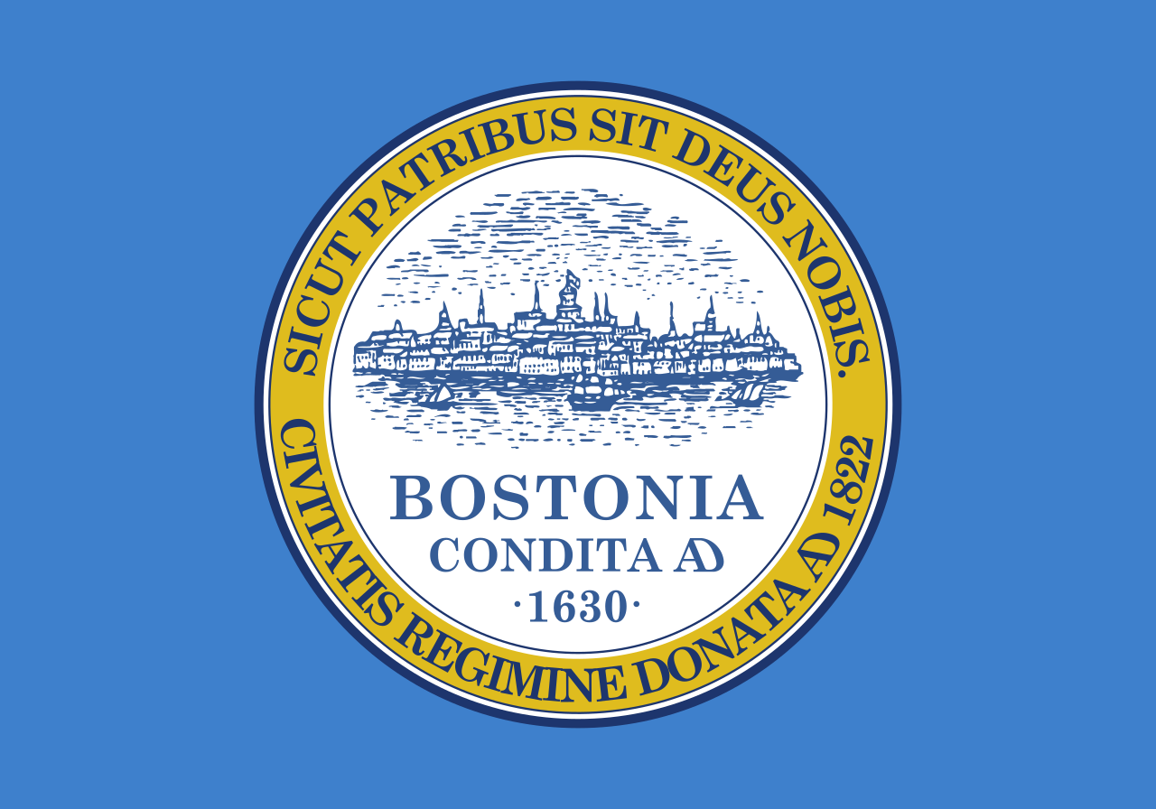
Boston’s flag:
Let’s put them to the test:
- Keep it Simple: FAIL
- Use Meaningful Symbolism: Very questionable – does an old city skyline really mean much to people?
- Use Two to Three Basic Colours: Pass! Almost. Pick just one blue and we’re good.
- No Lettering or Seals: DOUBLE FAIL
- Be Distinctive or Be Related: Possible pass. The colors are somewhat unique (is “powder blue” really the color symbolism we’re going for, though?). But a seal on a big field of color is the antithesis of distinctive.
Providence’s flag:
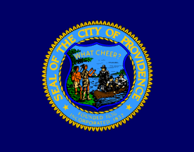
- Keep it Simple: Super epic huge fail. Could you even describe this flag if you hadn’t learned in a history class what the picture in the middle probably is?
- Use Meaningful Symbolism: Roger Williams being greeted by the Narragansett people is probably a good call, as it harkens back to relatively positive and peaceful and respectful beginnings for the city and state. But is it “symbolic” to just draw out the whole scene? What is a more distinctive symbol to use? The peace pipe itself seems like a good call, except for how everyone who hates smoking / drugs / etc will hate it.
- Use Two to Three Basic Colours: I count seven at first glance, but it’s so complicated that there could be more hiding in there.
- No Lettering or Seals: Triple fail – has three different written elements, one of them is unnecessarily wordy, and one of them isn’t even legible up close on my computer screen. Also, it’s a seal.
- Be Distinctive or Be Related: Possible pass, like D-. The fact that Boston and Providence both use the blue/yellow combo is actually a bit interesting. Seal on a field of color is NOT distinctive.
And then, I realized that the fact that I was drawn to consider nearby major city’s flags rather than my own city’s flag probably means that it is so very insignificant that I can’t even remember what it might look like, even when I try really hard. So the logic from the video holds that it’s probably even worse – because literally no one is using it.
Yup – check out the flag of Pawtucket, RI (maybe):
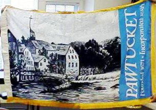
Is this even actually Pawtucket’s flag? All of Google cannot tell me. I might go down to city hall to find out, if I decide to actually try to do anything about this.
- Keep it Simple: A photo or detailed illustration with 3 points of info written in text is the antithesis of this.
- Use Meaningful Symbolism: I agree that Slater Mill should very probably be what we harken back to. Better than the actual mill itself (which is defunct and not in use), something that brings to mind the creativity and ingenuity that still thrive here and make our city great, unique, and hard-working would be much better, though.
- Use Two to Three Basic Colours: This is four. Not the worst thing ever.
- No Lettering or Seals: So. Much. Lettering. Look at how stupid it is when it is viewed from the opposite of the intended main side. When flying, it will look like this half the time. No, no, no.
- Be Distinctive or Be Related: I suppose it gets an A for this. No one uses a photo / illustration on their flag, even if it is because it’s a horrible idea. But at least that makes it “distinctive”. And the fact that the colors are the same blue and yellow as we’ve been seeing in other New England city flags is interesting and cool.
As a resident of Pawtucket, I suppose that is the one I could/should have the most impact on. Do I have the time, political capital, and drive to change these things?


